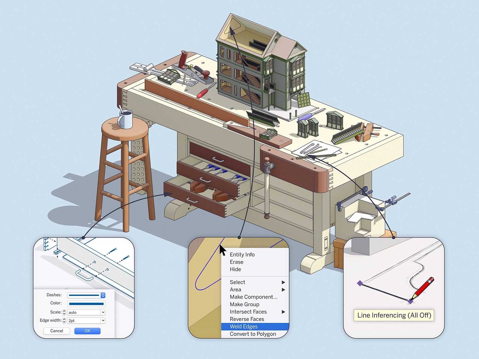
After introducing SketchUp 2020 in January and sharpening it in April, we’re pleased to announce an August update as well. This go-around, we’ve narrowed in on a few long-standing requests. Let’s take a closer look.
Linear inference toggles for the Line tool in SketchUp
SketchUp inferencing comes in all shapes and sizes. One of the most distinct is the linear inferencing that allows you to snap or lock to the red, green, and blue axes. Of course, linear inferencing makes SketchUp work, but it can also get in the way. For instance, if you are working with very small spaces or tracing images, we’ve heard from you that it would be handy for inferencing to get out of the way.
As the first step in this direction, the Line tool now features a modifier key [(ALT) on Win and (CMD) on Mac] to toggle linear inferencing on and off, so you can draw edges without being snapped to an inference. You can turn off all inferences, or leave only parallel and perpendicular inferencing on.
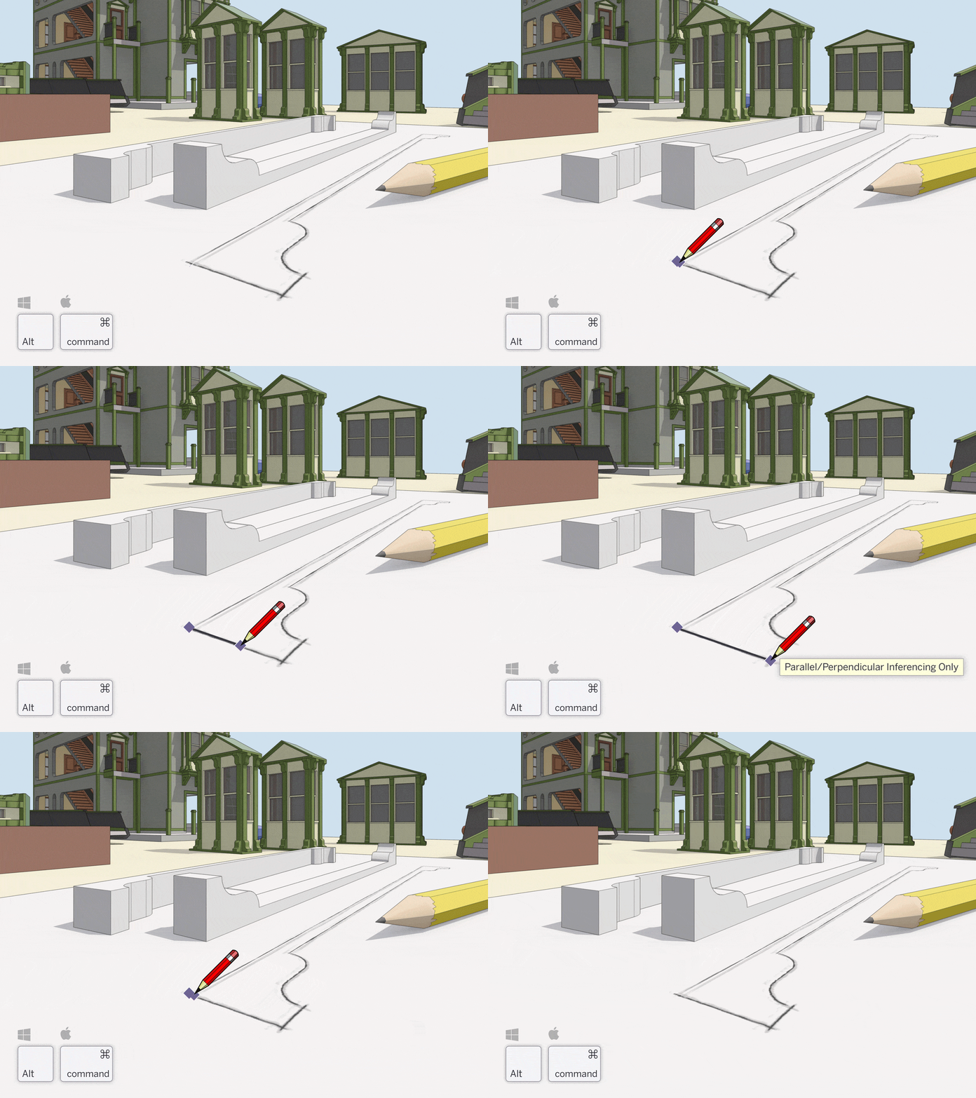 Of course, you can still jump to a specific inference — red, green, blue, or magenta — using the arrow keys. We’re considering expanding on this idea, so we’d love to hear your impressions.
Weld Edges in SketchUp
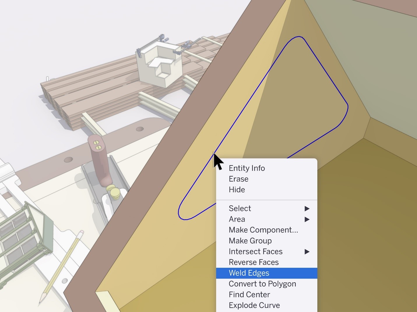
In our April update, we implemented a proper weld function in our API to help speed up extensions that need to do weld operations. Now, we’ve added ‘Weld Edges’ to SketchUp’s native tools.
This means you can join edges and arcs into a single polyline without installing an extension. If you haven’t used a weld extension, we recommend starting to weld edges for any face where you’d like a smooth push/pull extrusion. Select the edges you want to join, right-click and select Weld Edges.
Control line width, color, and pattern by tag in LayOut
Over the years, we’ve learned a lot about how people use stacked viewports to create phenomenal LayOut drawings. The biggest lesson: it would be great if you didn’t have to stack performance-impacting viewports to get drawings to look the way you want.
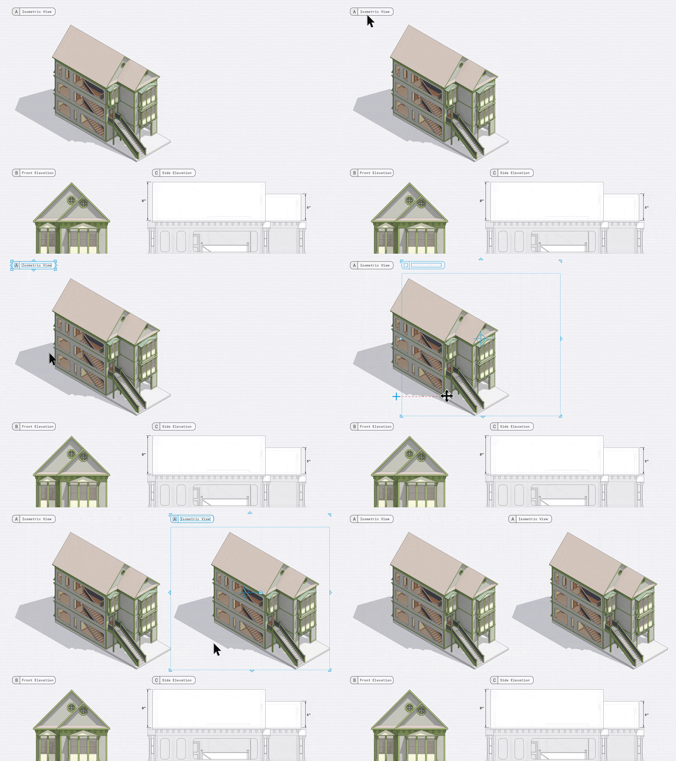
We’re happy to share that you can now control the line style of SketchUp tags in LayOut. Before this update, rendering a plan view with different line weights meant hiding a bunch of geometry, creating different scenes, and stacking viewports in LayOut. Now, you can adjust the edge width, color, dash pattern, and dash scale in one viewport by assigning and styling tags.
Whether you need control of line styles for architectural drawings, production drawings, and details, or general illustration, we’d love to hear your impressions… or better yet, see your work.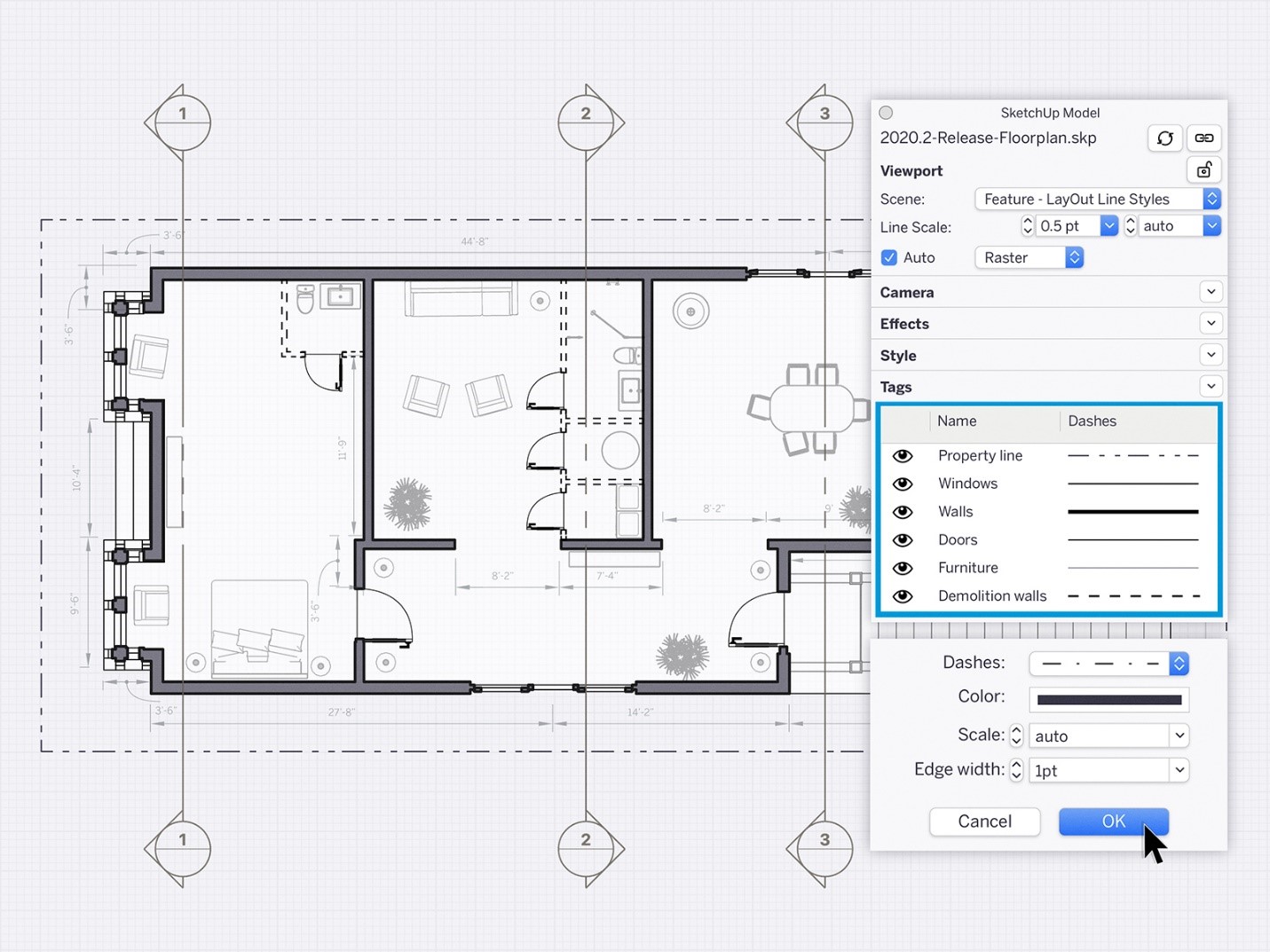
Will you share some examples of drawings you make (or would like to make) in SketchUp and LayOut?
Smoother operations in larger LayOut documents
Good LayOut documents are an arrangement of viewports, images, vector graphics, and labels. As pages get complex and documents get longer, operating on selections gets slower.
To help speed up these larger files, we made a change to how move, copy, and scale operations work. Now, LayOut previews these transformations instead of drawing them in real-time as you are manipulating a selection. When you complete a move, copy, or scale operation, then LayOut redraws your action.
This is a subtle change, but it brings a new feel and a little more efficiency to LayOut.
High-resolution aerial imagery with Add Location enhancements
ICYMI, we partnered with Nearmap to make it easier for you to access high-resolution aerial imagery directly in SketchUp last week. The best news? Imagery is never older than 12 months. Add the backdrop of reality to all of your landscape and urban planning designs. Read all about it here.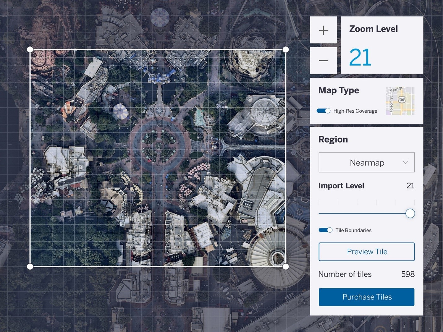
We hope you’ll explore these features and let us know how they impact your workflow. Understanding the work you do allows us to keep improving SketchUp… work that we deeply appreciate!


 Tiếng Việt