Another exciting release day over here at SketchUp! Based heavily on user feedback (we take it seriously!), we’ve polished up existing features and made some exciting additions that will have your workflow humming with joy!
Freshening up SketchUp Pro
1. Scenes Panel
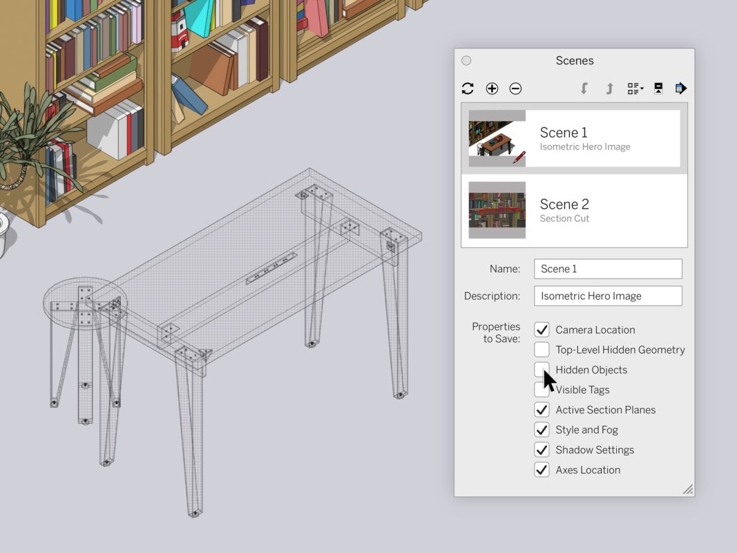
Now that you’ve had some time to enjoy better toggling visibility with hidden geometry and objects, we’ve decided to make it even better. We split up hidden geometry and hidden objects so you can select and save them separately on a Scene-by-Scene basis. You will see a new checkbox in the Scenes panel that lets you save the visibility state of hidden objects, not just hidden geometry. This gives you better visibility control per Scene.
2. Section Planes & Scenes
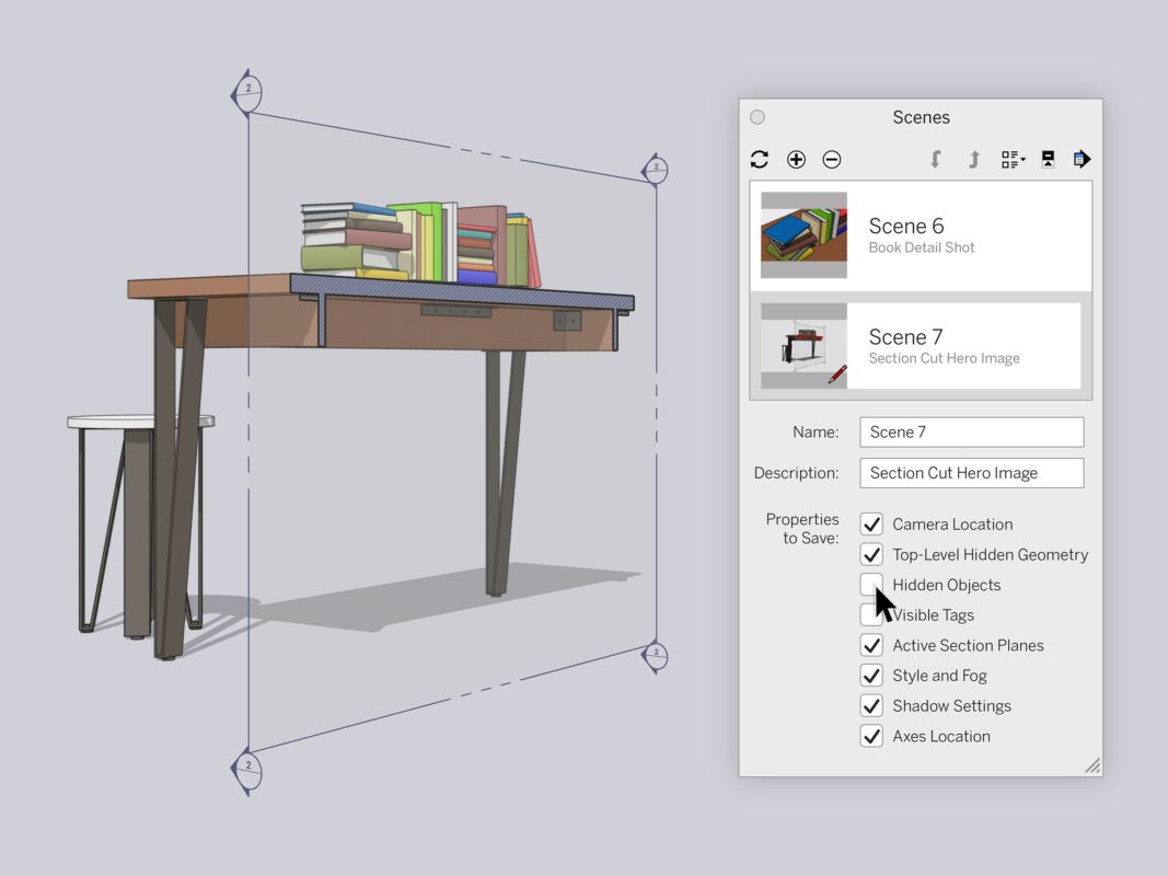
Scenes are feeling so seen in this release! In this new version of SketchUp, you can now save Section Plane visibility per Scene. Since Section Planes are grouped with objects, we want to make sure they behave like objects.
What’s the value here? Before this change, only top-level visibility could be saved per Scene. Again, more control in your Scenes — and consistency across functionality. Winning!
3. Hidden Objects
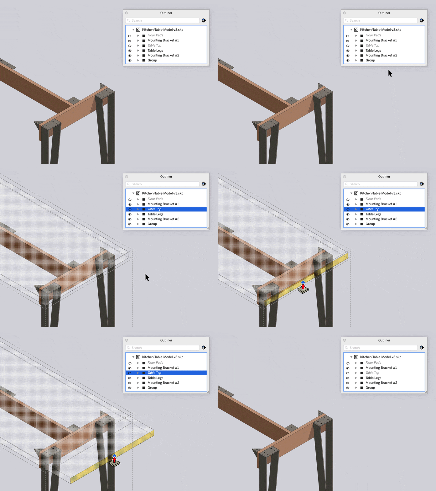
Good news… hidden objects are now editable. Editing invisible things might sound like a superpower, but it’s really just a great new feature. When you select a hidden object in Outliner, it will now appear as a mesh.
This means that you can make more precise edits with ease, instead of trying to adjust an object you can’t see. So keep on keeping on without hindering your editing workflow. It’s not the armor that makes the hero, but the modeler inside. Check out this Quick Win to see how it’s done.
4. Improvements to Grips.
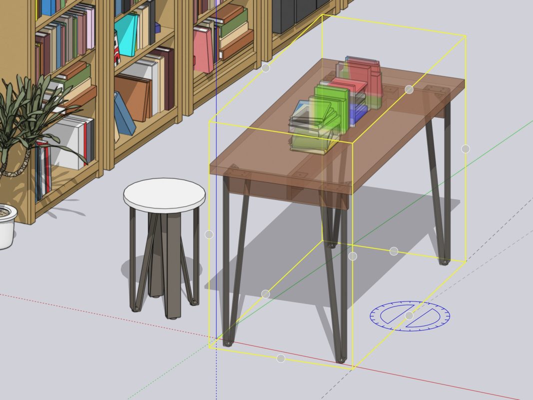
A small, but powerful feature: you can now cycle through ALL Grips when using the Rotate tool — just like the Move tool! This provides more consistency between the tools so you can stay focused on your project.
Check out this Quick Win from our 2020 release to help you understand Grips.
5. Empty Object
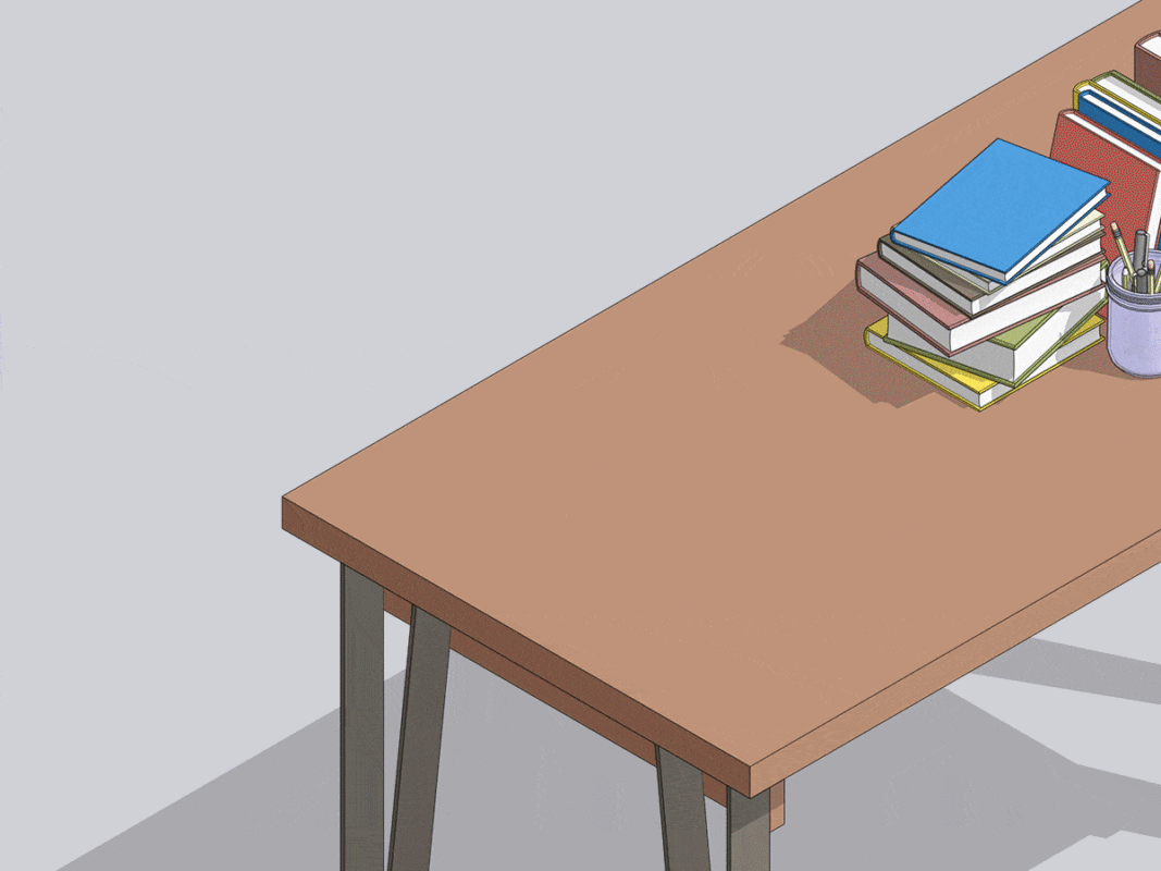
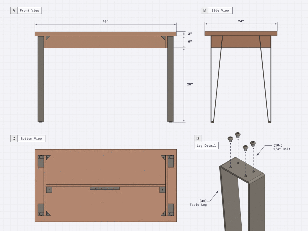
Picture this: you are working up a new table design and quickly model a lamp to make it look more realistic — but oops! — you did it too fast and forgot to group your lamp and table separately. Now, everything is glued together, creating editing issues galore and wasted time.
Fret no more! Now, you can start creating a grouped object or component by right-clicking on an empty space. Psst…You can also use the ‘G’ shortcut to create a new component, which means you wouldn’t have to find an empty space to right-click on. (Shortcut win!)
No more triple-clicking to select and then group, or drawing it elsewhere just to place it where you want it. And, an added bonus! When you create a new component from scratch, a window will immediately pop up allowing you to name it. Say hello to better model organization. Talk about speeding up your workflow!
Check out this Skill Builder to see how to use this feature in your workflow.
6. Performance improvements in LayOut
7. Improved Select Tool

The Select Tool just got some major love. We wanted to help you make intentional — not accidental — moves with your crossing and window selection workflows.
Now, when you click-drag to create a crossing or window selection, you won’t mistakenly move anything. If you’ve encountered this, you know what we’re talking about… and you’re welcome! If you’re wondering, “how do I move an object now?” — no worries, we got you covered.
Just pre-select an entity and move from there. Also, selections and moves now occur when clicking on the actual object as opposed to the object’s bounding box, strengthening that intentional workflow.
Download the new version, play with our latest features, and let us know what you think in the forums. As always, we will be there listening, responding, and getting great ideas for new updates… all with a smile. See you on the Axis!


 Tiếng Việt