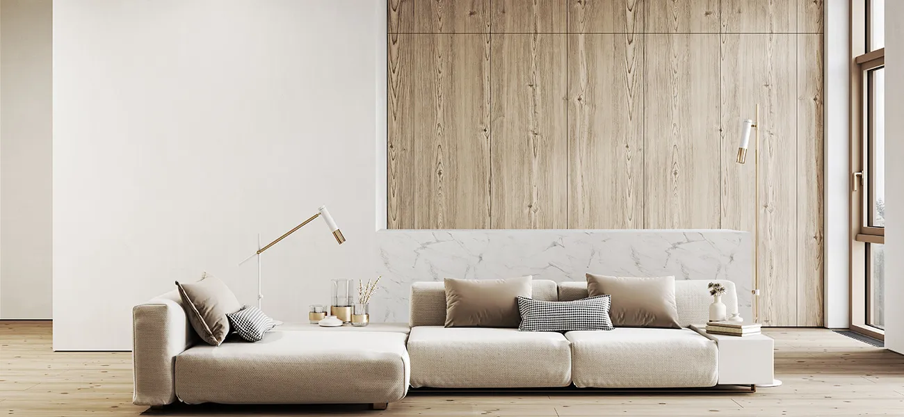
Negative space in interior design is a positive thing. It’s that space that allows you to move from room to room with ease. Energy flows freely around the home, just like the people in it. Negative space also showcases your much-loved objects and pieces in your home that you want to highlight.
What is Negative Space?
Negative space is that area in your home that does not have anything in it—no furniture, no décor, no plant, no budol items, nothing. The pack rat may find this difficult so if it is so against your nature not to fill in all the blanks, then use the Cluttercore interior style. Still, there are still negative spaces in this interior style.
Negative space is part of one of the seven elements of interior design. You need to balance the negative space with the positive space (so all those areas with something in it). This refers to the horizontal as well as the vertical space in the room.
Here are three main reasons for having negative spaces in your home.
1. Have Some Breathing Space
In feng shui, clutter is considered a negative element because it stops the energy (or qi) from flowing freely around the home. People can immediately feel if your place is relaxing or discordant. You don’t have to go for minimalist interiors if that is not your style. But if you own many things, then you must curate and arrange them well.
Color is also an element you have to consider in negative space. Neutrals and whites do not necessarily mean that you are going to create a calm space, although these light colors help. Going for just cool colors is also not what is meant here. You can have warm, vibrant colors and still make the space feel harmonious.
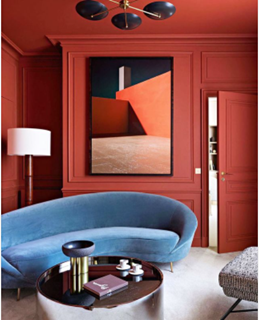
Contrasting colors red and blue would normally feel intense. But in the space above, you see that there is “breathing space” brought about by the white carpeted floor. Most important, there are very few things in the room—a huge painting, a curved sofa, a chair, a coffee table, a floor lamp, and a pendant lamp. There may be objects on the table but there are not too many of them.
There is a lot of negative space on the walls (just one statement painting) and around the seating layout. The curved sofa, very much in fashion nowadays, is also a statement piece. Negative space around these objects makes them stand out. This brings us to the next reason for having negatives spaces in your interior design.
2. Show Off Your Stuff
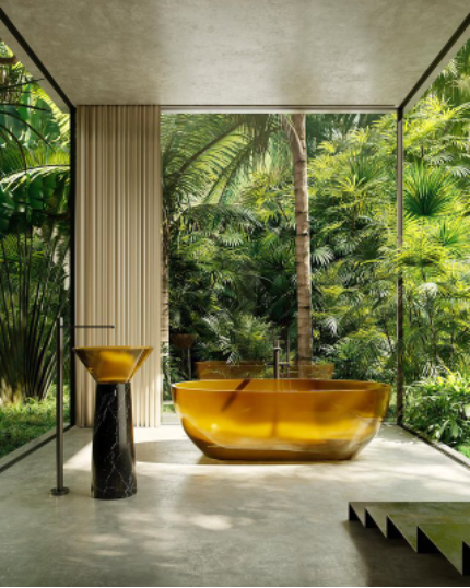
The best way to highlight something is when you create a negative space around it so that it becomes the focal point.
There is no doubt who the main star in this bathroom is. The vignette is a perfect combination of green and gold. Although the nature surrounding this bathroom is fantastic, the lustrous bathtub is definitely the main event. This is a very elegant way to say, “Maligo ka na.”
3. Consider Foot Traffic
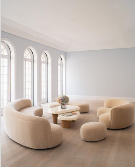
Think about foot traffic when you design a room. What is the focal point and where should people pass?
When you look at a room, the focal point can sometimes be already chosen for you. For example, if you are moving into an existing build, you may find that the TV outlet has already been installed. Unless you don’t have a TV or you don’t want the added expense of moving the outlet somewhere else, you then have to use that as the focal point in the room.
However, if you have a blank canvas like in the living room above, your conversation area becomes your focal point. Here, the room is big enough to have this whole sitting area placed in the center of the room, which by the way gives the illusion of a much bigger space. Still, the room looks intimate and cozy because of the curvy furniture and the way they create a circle at the center. Bring the furniture close to each other yet allow for small entry points around the circle. This also encourages people to be close enough that they don’t have to strain when they join the discussion.
Here is a layout of a simple one-bedroom condo. The hallway and areas for foot traffic should be wide and free from obstructions so that people can move from room to room smoothly.
Tip: If your space is big enough, don’t push your furniture against the wall.
Key Takeaway
When planning the layout of your home, think of negative space and how and where you can bring it in so that you increase the attractiveness of your place. Resist filling in all the spaces with things, and that includes your walls, to avoid sensory overload. Only when you allow negative space can you highlight the pieces you are most proud of, make a route for energy and people to circulate freely in your home, and create a home that is visually pleasing and relaxing.
Source: Myboysen


 Tiếng Việt
